Starting Eyja Text
Last week, I started working on the text versions for Eyja. In case you haven’t known, Eyja is my revival project started in the Type@Cooper program in 2021, based on a serif typeface found in an 1852 edition of Visit to Iceland and The Scandinavian North by Ida Pfeiffer. The initial version is released through Counter Forms.
While reviewing my source book for Eyja, Vincent, my former teacher, asked about the original typeface used. Embarrassingly, I hadn't researched it much and had only been focused on the forms and curved serifs in the source.
Looking at two typefaces on Fonts In Use—Selva by Fanny Hamelin and ABC Synt by Kaj Lehman—I discovered the Scotch/Modern typefaces. I may have heard of it before.
Origins
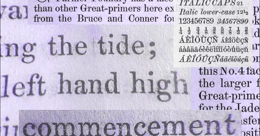
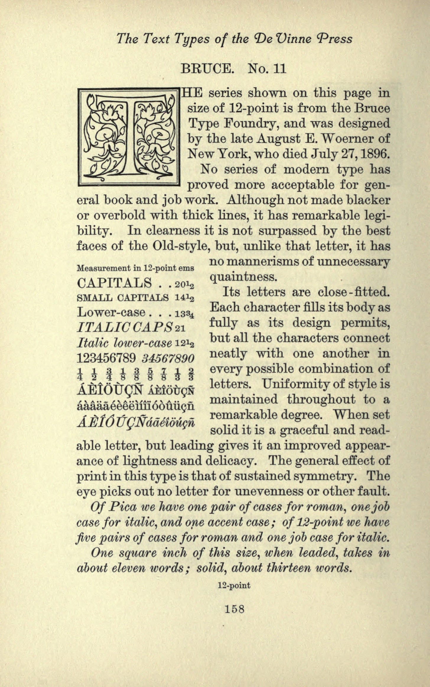
The Scotch typeface originated from the work of English punch cutter Richard Austin for the Scottish foundries of William Miller and Alexander Wilson around 1812. A version of it is Pica No.2. Then it was sold and used largely in the United States. Another version is Bruce typefaces by George Bruce & Son, which I believe has the most similar features in Eyja. It is also the source for Scotch Modern drawn by Nick Shinn (Shinn Type).
Features
In Historic printing types, a lecture read before the Grolier club of New York, January 25, 1885, with additions and new illustrations, De Vinne described Scotch Roman as having small, neat, and round letters with long ascenders. They are not noticeably condensed or compressed.
Although they can be classified as a "modern" typeface due to their large ball terminals, horizontal serifs, sharply vertical axis, and high stroke contrast, Scotch Romans have distinct differences from other modern styles such as Bodoni and Didot. For instance, the serifs are broad and flat but still bracketed, apertures are frequently narrow, and stroke widths tend to be slightly more modulated. Scotch fonts can be used for both body text and headings.
While working at the State Library today, I had the opportunity to read Sofie Beier's book on designing for legibility. One section of the book discussed Scotch Roman typefaces. According to her research survey, although it allows for fast reading, readers perceived it as less legible, especially at a distance and under reduced illumination.
“Trust your eyes” during digitisation process
I also came across an interesting phrase in Nick Shinn's description of Scotch Modern: "bezier-drawn by eye with the aid of the loupe." In his Modern Suite specimen, Shinn quotes Stanley Morison's A Tally of Types:
“The task of renovating or recreating a design from old impressions is the most difficult of all. The effect of impressing upon damp paper, of worn type, and of the spread of ink, have to be reckoned with; and great skill is needed if, while removing blurred outlines, the subtleties of the original engraving are not to be lost.”
This reminds me of something my design lecturers often said: "Trust your eyes." I would say that most of digitisation involves decision-making rather than drawing.
That's all for today. I'm going back to Eyja Text drawing, taking into account what I learned about the beautiful features of Modern/Scotch typefaces earlier. Catch ya later! 🤓


